- The Systemizer
- Posts
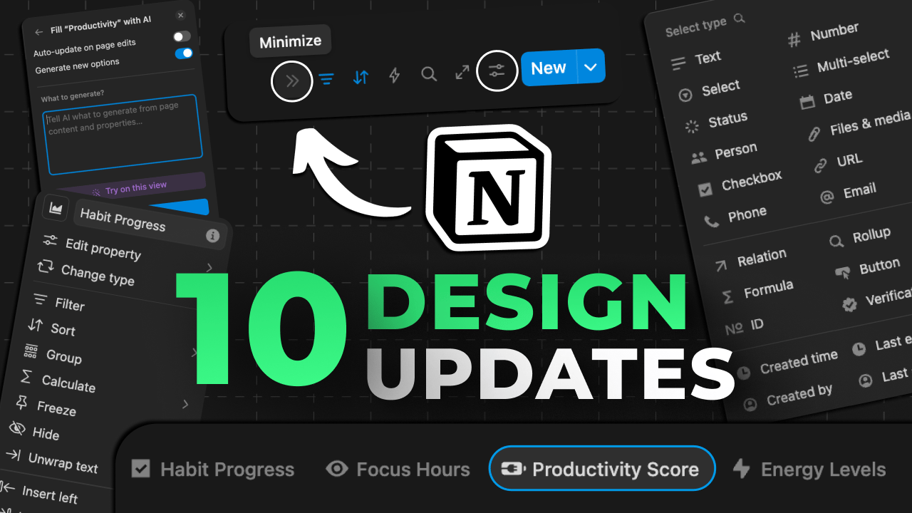
- Notion's NEW UI/UX Redesign...

Most people think productivity is just about motivation, discipline, or habits.
But in my experience, one of the most underrated drivers of consistency is design.
If your system looks cluttered, you’ll avoid it.
If it feels overwhelming, you’ll procrastinate.
If it’s confusing, you’ll give up.
But when the design is clean, minimal, and intuitive—
You use the system.
You trust the system.
You stick with the system.
The better your system feels, the more likely you are to keep using it.
And that’s how you build consistency, without needing more willpower.
Notion just rolled out a major design update that embodies this exact principle.
Aesthetics should serve function.
If it doesn’t make the system easier to use, it’s just clutter.
And they’ve just simplified the design of Notion and how we interact with it massively.
The result?
A system that doesn’t just look better, but feels easier to use.
And that means it’s more likely to actually get used.
I made a YouTube video breaking down all the new updates, both the big design updates and the smaller updates that you’ve probably missed.
Check out the video on YouTube here:
No fluff. Just systems.
Chris “The Systemizer” Punt